graphic design
art
Introduction
the art and profession of selecting and arranging visual elements—such as typography, images, symbols, and colours—to convey a message to an audience. Sometimes graphic design is called “visual communications,” a term that emphasizes its function of giving form—e.g., the design of a book, advertisement, logo, or Web site—to information. An important part of the designer's task is to combine visual and verbal elements into an ordered and effective whole. Graphic design is therefore a collaborative discipline: writers produce words and photographers and illustrators create images that the designer incorporates into a complete visual communication.
The evolution of graphic design as a practice and profession has been closely bound to technological innovations, societal needs, and the visual imagination of practitioners. Graphic design has been practiced in various forms throughout history; indeed, strong examples of graphic design date back to manuscripts in ancient China, Egypt, and Greece. As printing and book production developed in the 15th century, advances in graphic design developed alongside it over subsequent centuries, with compositors or typesetters often designing pages as they set the type.
In the late 19th century, graphic design emerged as a distinct profession in the West, in part because of the job specialization process that occurred there, and in part because of the new technologies and commercial possibilities brought about by the Industrial Revolution. New production methods led to the separation of the design of a communication medium (e.g., a poster) from its actual production. Increasingly, over the course of the late 19th and the early 20th centuries, advertising agencies, book publishers, and magazines hired art directors who organized all visual elements of the communication and brought them into a harmonious whole, creating an expression appropriate to the content. In 1922 typographer William A. Dwiggins (Dwiggins, William Addison) coined the term graphic design to identify the emerging field.
Throughout the 20th century, the technology available to designers continued to advance rapidly, as did the artistic and commercial possibilities for design. The profession expanded enormously, and graphic designers created, among other things, magazine pages, book jackets, posters, compact-disc covers, postage stamps, packaging, trademarks, signs, advertisements, kinetic titles for television programs and motion pictures, and Web sites. By the turn of the 21st century, graphic design had become a global profession, as advanced technology and industry spread throughout the world.
Typography is discussed in this essay as an element of the overall design of a visual communication; for a complete history, see typography. Similarly, the evolution of the printing process is discussed in this essay as it relates to developments in graphic design; for a complete history, see printing.
Historical foundations
Manuscript design in antiquity and the Middle Ages
Although its advent as a profession is fairly recent, graphic design has roots that reach deep into antiquity. Illustrated manuscripts were made in ancient China, Egypt, Greece, and Rome. While early manuscript designers were not consciously creating “graphic designs,” scribes and illustrators worked to create a blend of text and image that was at once harmonious and effective at conveying the idea of the manuscript. The ancient Egyptian Book of the Dead, which contained texts intended to aid the deceased in the afterlife, is a superb example of early graphic design. Hieroglyphic narratives penned by scribes are illustrated with colourful illustrations on rolls of papyrus. Words and pictures are unified into a cohesive whole: both elements are compressed into a horizontal band, the repetitive vertical structure of the writing is echoed in both the columns and the figures, and a consistent style of brushwork is used for the writing and drawing. Flat areas of colour are bound by firm brush contours that contrast vibrantly with the rich texture of the hieroglyphic writing.
During the Middle Ages, manuscript books preserved and propagated sacred writings. These early books were written and illustrated on sheets of treated animal skin called parchment, or vellum, and sewn together into a codex format with pages that turned like the pages of contemporary books. In Europe, monastic writing rooms had a clear division of labour that led to the design of books. A scholar versed in Greek and Latin headed the writing room and was responsible for the editorial content, design, and production of books. Scribes trained in lettering styles spent their days bent over writing tables, penning page after page of text. They indicated the place on page layouts where illustrations were to be added after the text was written, using a light sketch or a descriptive note jotted in the margin. Illuminators, or illustrators, rendered pictures and decorations in support of the text. In designing these works, monks were mindful of the educational value of pictures and the capacity of colour and ornament to create spiritual overtones.
Manuscript production in Europe during the Middle Ages generated a vast variety of page designs, illustration and lettering styles, and production techniques. Isolation and poor travel conditions allowed identifiable regional design styles to emerge. Some of the more distinctive medieval art and design approaches, including the Hiberno-Saxon (Hiberno-Saxon style) style of Ireland and England and the International Gothic style prevalent in Europe in the late 14th and early 15th centuries, were used in manuscript books that achieved major graphic-design innovations. The Book of Kells (Kells, Book of) (c. AD 800), an illuminated gospel book believed to have been completed in the early 9th century at the Irish monastery of Kells, is renowned as one of the most beautiful Hiberno-Saxon (Hiberno-Saxon style) manuscripts. Its page depicting the appearance of Jesus Christ's name in Matthew 1:18 is called the “Chi-Rho page.” The design presents the monogram XPI—which was used to signify Christ in many manuscripts—as an intricately designed pattern of shimmering colour and spiraling forms blossoming over a whole page. The Book of Kells's Chi-Rho page is a paradigm of how graphical form can become a metaphorical expression of spiritual experience: it clearly conveys the sacred nature of the religious content.
From the 10th through the 15th centuries, handmade manuscript books in Islamic lands also achieved a masterful level of artistic and technical achievement, especially within the tradition of Persian miniature painting. The pinnacle of the Shiraz school (Shīrāz school) of Persian manuscript design and illustration is evident in a page illustrating the great 12th-century poet Neẓāmī's Khamseh (“The Quintuplet”). This page depicts the Persian king Khosrow II in front of the palace of his beloved, Shīrīn. Human figures, animals, buildings, and the landscape are presented as refined shapes that are defined by concise outlines. These two-dimensional planes are filled with vibrant colour and decorative patterns in a tightly interlocking composition. The calligraphic text is contained in a geometric shape places near the bottom of the page.
Early printing and graphic design
While the creation of manuscripts led to such high points in graphic design, the art and practice of graphic design truly blossomed with the development of printmaking technologies such as movable type. Antecedents of these developments occurred in China, where the use of woodblock (woodcut), or relief, printing, was developed perhaps as early as the 6th century AD. This process, which was accomplished by applying ink to a raised carved surface, allowed multiple copies of texts and images to be made quickly and economically. The Chinese also developed paper made from organic fibres by AD 105. This paper provided an economical surface for writing or printing; other substrates, such as parchment and papyrus, were less plentiful and more costly to prepare than paper.
Surviving artifacts show that the Chinese developed a wide range of uses for printing and that they achieved a high level of artistry in graphic design and printing from an early date. Artisans cut calligraphic symbols into woodblocks and printed them beautifully; printed sheets of paper bearing illustrations and religious texts were then pasted together to make printed scrolls. By the 9th or 10th century, paged woodblock books replaced scrolls, and literary, historical, and herbal works were published. Paper money and playing cards were also designed, their designs cut into woodblocks and printed. Chinese alchemist Bi Sheng invented a technique for printing with movable type about AD 1041–48; however, this technology did not replace the hand-cut woodblock in Asia, in part because the hundreds of characters used in calligraphic languages made setting and filing the movable characters difficult.
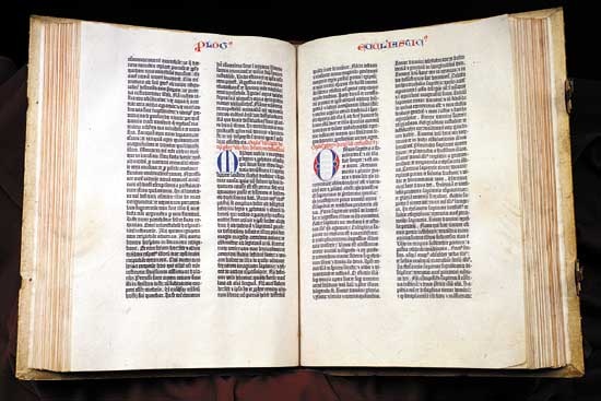 Chinese inventions slowly spread across the Middle East and into Europe. By the 15th century, woodblock broadsides and books printed on paper were being made in Europe. By 1450 Johannes Gutenberg (Gutenberg, Johannes) of Mainz (Germany) invented a method for printing text from raised alphabet characters cast on movable metal types. After this, printed books began to replace costly handmade manuscript books. Designers of early typographic books in Europe attempted to replicate manuscripts, often designing type styles based on current manuscript lettering styles. When the type was printed, spaces were left for illuminators to add pictures, ornate initials, and other decorative material by hand. In this way, the compositor or typesetter was in effect the designer as he set the type. Some surviving copies of Gutenberg (Gutenberg Bible)'s landmark 42-line Bible have headers, initials, and sentence markers applied by hand in red and blue inks.
 Over time, typographic books developed their own design vocabulary. By the mid-15th century, printers combined woodblock illustrations with typeset text to create easily produced, illustrated printed books. They printed woodblock decorative borders and ornamental initials along with the type, subsequently having colour applied by hand to these printed elements. The first complete printed title page—identifying the book title, author, printer, and date—was designed for Regiomontanus's Calendarium in 1476.
The prevalence of movable type and increasingly advanced printing technology in Europe meant that, while other cultures continued to create manuscript designs and printed communications, major advances in graphic design over the next several centuries would often be centred in Europe.
Graphic design in the 16th–18th centuries
Renaissance book design
The Renaissance saw a revival, or “rebirth,” of Classical learning from ancient Greece and Rome throughout Europe. Beginning in the late 15th century, printing played a major role in this process by making knowledge from the ancient world available to all readers. Typeface designs evolved toward what are now called Old Style types, which were inspired by capital letters found in ancient Roman inscriptions and by lowercase letters found in manuscript writing from the Carolingian period.
The Italian scholar and printer Aldus Manutius the Elder (Manutius, Aldus, the Elder) founded his Aldine Press in 1495 to produce printed editions of many Greek and Latin classics. His innovations included inexpensive, pocket-sized editions of books with cloth covers. About 1500 Manutius introduced the first italic typeface, cast from punches cut by type designer Francesco Griffo. Because more of these narrow letters that slanted to the right could be fit on a page, the new pocket-sized books could be set in fewer pages.
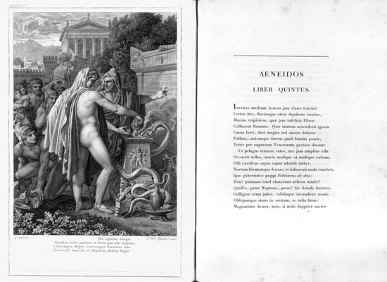
 The prototype for Renaissance book design was the Aldine Press's 1499 Hypnerotomachia Poliphili, believed to be written by Francesco Colonna. The design of the work achieves an understated simplicity and tonal harmony, and its elegant synthesis of type and image has seldom been equaled. The layout combined exquisitely light woodcuts by an anonymous illustrator with roman types by Griffo utilizing new, smaller capitals; Griffo cut these types after careful study of Roman inscriptions. Importantly, double-page spreads were conceived in the book as unified designs, rather than as two separate pages.
 During the 16th century, France became a centre for fine typography and book design. Geoffroy Tory (Tory, Geoffroy)—whose considerable talents included design, engraving, and illustration, in addition to his work as a scholar and author—created books with types, ornaments, and illustrations that achieved the seemingly contradictory qualities of delicacy and complexity. In his Book of Hours (1531), he framed columns of roman type with modular borders; these exuberant forms were a perfect complement to his illustrations.
Typeface designer and punch-cutter Claude Garamond (Garamond, Claude), one of Tory's pupils, achieved refinement and consistency in his Old Style fonts. Printers commissioned types from him rather than casting their own, making Garamond the first independent typefounder not directly associated with a printing firm. Works by Tory, Garamond, and many other graphic artists and printers created a standard of excellence in graphic design that spread beyond France.
The 17th century was a quiet time for graphic design. Apparently the stock of typeface designs, woodblock illustrations, and ornaments produced during the 16th century satisfied the needs of most printers, and additional innovation seemed unnecessary.
Rococo graphic design
The 18th-century Rococo (Rococo style) movement, characterized by complex curvilinear decoration, found its graphic-design expression in the work of the French type (typography)founder Pierre-Simon Fournier (Fournier, Pierre-Simon). After studying art and apprenticing at the Le Bé type foundry, Fournier opened his own type design and foundry operation. He pioneered standardized measurement through his table of proportions based on the French pouce, a now-obsolete unit of measure slightly longer than an inch. The resulting standard sizes of type enabled him to pioneer the “type family,” a series of typefaces with differing stroke weights and letter widths whose similar sizes and design characteristics allowed them to be used together in an overall design. Fournier designed a wide range of decorative ornaments and florid fonts, enabling French printers to create books with a decorative design complexity that paralleled the architecture and interiors of the period. Because French law forbade typefounders from printing, Fournier often delivered made-up pages to the printer, thereby assuming the role of graphic designer.
Copperplate engraving became an important medium for book illustrations during this period. Lines were incised into a smooth metal plate; ink was pressed into these recessed lines; excess ink was wiped clean from the surface; and a sheet of paper was pressed onto the plate with sufficient pressure to transfer the ink from the printing plate to the paper. This allowed book illustrations to be produced with finer lines and greater detail than woodblock printing. In order to make text more compatible with these fine-line engravings, designers increasingly made casting types and ornaments with finer details. English engraver Robert Clee's engraved trading card demonstrates the curvilinear decoration and fine detail achieved in both text and image by designers during the Rococo.
 Graphic design often involves a collaboration of specialists. Many 18th-century artists specialized in book illustration. One such artist was Frenchman Charles Eisen, who illustrated French poet Jean de La Fontaine (La Fontaine, Jean de)'s Contes et nouvelles en vers (1762; Tales and Novels in Verse). In this work, Joseph Gerard Barbou, the printer, used types and ornaments by Fournier, full-page engravings by Eisen, and complex spot illustrations and tailpieces by Pierre-Phillippe Choffard. This superb example of Rococo book design combined the ornamented types, decorative initials, elaborate frames and rules, and intricate illustrations typical of the genre.
Neoclassical graphic design
In the second half of the 18th century, some designers tired of the Rococo style and instead sought inspiration from Classical art. This interest was inspired by recent archaeological finds, the popularity of travel in Greece, Italy, and Egypt, and the publication of information about Classical works. Neoclassical (Classicism and Neoclassicism) typographical designs used straight lines, rectilinear forms, and a restrained geometric ornamentation. John Baskerville (Baskerville, John), an English designer from the period, created book designs and typefaces that offered a transition between Rococo and Neoclassical. In his books he used superbly designed types printed on smooth paper without ornament or illustration, which resulted in designs of stately and restrained elegance. Baskerville's fonts had sharper serifs and more contrast between thick-and-thin strokes than Rococo typefaces, and his letters had a more vertical, geometric axis.
In the late decades of the 18th and early decades of the 19th century, Giambattista Bodoni (Bodoni, Giambattista), the Italian printer at the Royal Press (Stamperia Reale) of the Duke of Parma, achieved Neoclassical ideals in his books and typefaces. Bodoni laid forth his design statement in Manuale tipografico (1788; “Inventory of Types”); another edition of this book was published in 1818, after his death, by his widow and foreman. Bodoni advocated extraordinary pages for exceptional readers. He achieved a purity of form with sparse pages, generous margins and line-spacing, and severe geometric types; this functional purity avoided any distractions from the act of reading. He drew inspiration from Baskerville as he evolved his preferences from Rococo-derived designs toward modern typefaces.
 The Didot Family of French printers, publishers, and typefounders also achieved Neoclassical ideals in their work. Books designed by the Didots have minimal decoration, generous margins, and simple linear borders. Pierre l'aîné Didot achieved technical perfection in his printing of the lavish éditions du Louvre. In these designs, Pierre utilized types designed at his brother Firmin's foundry, which provided a crisp counterpoint to the engraved illustrations by various artists working in the school of the French Neoclassical painter Jacques-Louis David (David, Jacques-Louis). The idealized figures in ancient Roman environments in the éditions were engraved with flawless technique, obsessive detail, and sharp contrasts of light and shadow.
Graphic design in the 19th century
The Industrial Revolution and design technology
The Industrial Revolution was a dynamic process that began in the late 18th century and lasted well into the 19th century. The agricultural and handicraft economies of the West had used human, animal, and water power, but they evolved into industrial manufacturing economies powered by steam engines, electricity, and internal-combustion motors. Many aspects of human activity were irrevocably changed. Society found new ways (often commercial) to use graphic designs and developed new technologies to produce them. Industrial technology lowered the cost of printing and paper, while making much-larger press runs possible, thus allowing a designer's work to reach a wider audience than ever before.
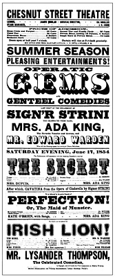 One popular medium for the graphic designer became the poster. Posters printed with large wood types were used extensively to advertise new modes of transportation, entertainment, and manufactured goods throughout the 19th century. This was possible in part because typefounders developed larger sizes of types for use on posted announcements and innovated new typefaces including sans serif, slab serif, and decorative designs. An American printer, Darius Wells, invented a lateral router that enabled the economical manufacture of abundant quantities of large wooden types, which cost less than half as much as large metal types. Wood-type posters usually had vertical formats; types of a mixture of sizes and styles were set in horizontal lines with a left-and-right alignment that created a visual unity. A poster produced in 1854 for the Chestnut Street Theatre in Philadelphia, for example, combined typefaces that were outlined, drop-shadowed, decorative, sans serif, slab serif, extremely wide, and narrow, all innovations that appeared during the 19th century.
 The poster became even more popular as a result of advances in lithography, which had been invented about 1798 by Alois Senefelder (Senefelder, Alois) of Bavaria. Building upon this discovery, colour lithographs, called chromolithographs (oleograph), were widely used in the second half of the 19th century, and designers created increasingly colourful posters that decorated the walls of cities, publicizing events, traveling entertainment shows, and household products. Designers of chromolithographic prints drew all the elements—text and image—as one piece of artwork; freed from the technical restraints of letterpress printing, they could invent fanciful ornaments and lettering styles at will. Many chromolithographs reflected an interest in the 1856 publication of English designer Owen Jones's The Grammar of Ornament, a methodical collection of design patterns and motifs that contained examples from Asian, African, and Western cultures. (Such explorations were consistent with the fascination with historicism and elaborate decoration found in architecture and product design during the Victorian era.)
 Momentum for this poster-design approach began in France, where poster designer Jules Chéret (Chéret, Jules) was a pioneer of the movement. Beginning his career in 1867, he created large-scale lithographic posters that featured vibrant colour, animated figures, textured areas juxtaposed against flat shapes, and happy, energetic figures capturing la belle époque of turn-of-the-century Paris. Chéret designed more than one thousand posters during his career.
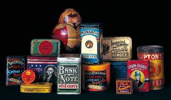 Chromolithography also made colourful pictures available to the homes of ordinary people for the first time in history. Designers developed ideas for packaged goods that were offered to the public in tins printed with iconic images, bright colours, and embellished lettering. They also created trade cards and “scrap,” which were packets of printed images of birds, flowers, and other subjects collected by children.
As the century progressed, graphic design reached many people through magazines, newspapers, and books. The automation of typesetting, primarily through the Linotype machine, patented in the United States in 1884 by Ottmar Mergenthaler, made these media more readily available. One Linotype operator could do the work of seven or eight hand compositors, dramatically reducing the cost of typesetting and making printed matter less expensive.
William Morris and the private-press movement
During the 19th century, one by-product of industrialism was a decline in the quality of book design and production. Cheap, thin paper, shoddy presswork, drab, gray inks, and anemic text typefaces were often the order of the day. Near the end of the century, a book-design renaissance began as a direct result of the English Arts and Crafts Movement. William Morris, (Morris, William) the leader of the movement, was a major figure in the evolution of design. Morris was actively involved in designing furniture, stained glass, textiles, wallpapers, and tapestries from the 1860s through the 1890s. Deeply concerned with the problems of industrialization and the factory system, Morris believed that a return to the craftsmanship and spiritual values of the Gothic (Gothic art) period could restore balance to modern life. He rejected tasteless mass-produced goods and poor craftsmanship in favour of the beautiful, well-crafted objects he designed.
In 1888 Morris decided to establish a printing press to recapture the quality of books from the early decades of printing. His Kelmscott Press began to print books in 1891, using an old handpress, rich dense inks, and handmade paper. Decorative borders and initials designed by Morris and woodblocks of commissioned illustrations were cut by hand. Morris designed three typefaces based on types from the 1400s.
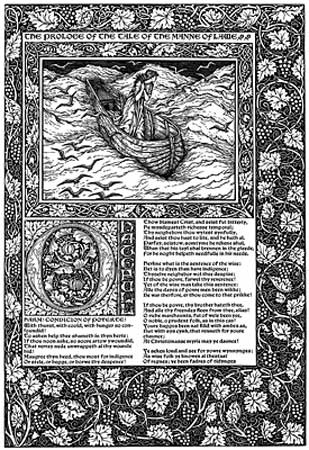 The Kelmscott Press recaptured the beauty and high standards of incunabula (texts produced when books were still copied by hand), and the book again became an art form. The press's masterwork is the ambitious 556-page The Works of Geoffrey Chaucer. Four years in the making, the Kelmscott Chaucer has 87 woodcut illustrations from drawings by renowned artist Edward Burne-Jones (Burne-Jones, Sir Edward Coley, 1st Baronet). For the single work, Morris designed 14 large borders, 18 smaller frames for the illustrations, and over 200 initial letters and words. An exhaustive effort was required by everyone involved in the project.
The influence of William Morris and the Kelmscott Press upon graphic design, particularly book design, was remarkable. Morris's concept of the well-designed page, his beautiful typefaces, and his sense of design unity—with the smallest detail relating to the total concept—inspired a new generation of graphic designers. His typographic pages, which formed the overwhelming majority of the pages in his books, were conceived and executed with readability in mind, another lesson heeded by younger designers. Morris's searching reexamination of earlier type styles and graphic-design history also touched off an energetic redesign process that resulted in a major improvement in the quality and variety of fonts available for design and printing; many designers directly imitated the style of the Kelmscott borders, initials, and type styles. More commercial areas of graphic design, such as job printing and advertising, were similarly revitalized by the success of Morris.
 The Kelmscott Press's influence became immediately apparent in the rise of the private-press movement: printers and designers established small printing firms to design and print carefully crafted, limited-edition books of great beauty. Architect and designer Charles Robert Ashbee (Ashbee, Charles Robert) founded the Essex House Press in London, and bookbinder Thomas James Cobden-Sanderson (Cobden-Sanderson, Thomas James) joined printer Sir Emery Walker (Walker, Sir Emery) in establishing the Doves Press at Hammersmith. Books from the Doves Press, including its monumental masterpiece, the 1903 Doves Press Bible, are remarkably beautiful typographic books. They have no illustrations or ornaments; the press instead relied upon fine paper, perfect presswork, and exquisite type and spacing to produce inspired page designs. The Ashendene Press, directed by Englishman C.H. St. John Hornby, was another exceptional English private press of the period. Following the example of Morris, these private presses believed strongly in the social value of making attractive and functional visual communications that were available to citizens of all walks of life.
In the United States, typeface designers, in particular Frederic W. Goudy (Goudy, Frederic W) and Morris F. Benton, revived traditional typefaces. Also inspired by the Arts and Crafts Movement, American book designer Bruce Rogers (Rogers, Bruce) played a significant role in upgrading book design. By applying the ideals of the beautifully designed book to commercial production, Rogers set the standard for well-designed books in the early 20th century. An intuitive classicist, Rogers possessed a fine sense of visual proportion. He also saw design as a decision-making process, feeling that subtle choices about margins, paper, type styles and sizes, and spatial position combine to create a unity and harmony. Type historian Beatrice Warde wrote that Rogers “managed to steal the Divine Fire which glowed in the Kelmscott Press books, and somehow be the first to bring it down to earth.”
Art Nouveau
Art Nouveau was an international design movement that emerged and touched all of the design arts—architecture, fashion, furniture, graphic, and product design—during the 1890s and the early 20th century. Its defining characteristic was a sinuous curvilinear line. Art Nouveau graphic designs often utilized stylized abstract shapes, contoured lines, and flat space inspired by Japanese ukiyo-e woodblock prints. Artists in the West became aware of ukiyo-e prints as trade and communication between Eastern and Western nations increased during the last half of the 19th century. Building upon the example of the Japanese, Art Nouveau designers made colour, rather than tonal modeling, the primary visual attribute of their graphics.
One of the most innovative posters of the Art Nouveau movement was artist Henri de Toulouse-Lautrec (Toulouse-Lautrec, Henri de)'s 1891 poster of the dancer La Goulue, who was then performing at the Moulin Rouge. Toulouse-Lautrec captured the atmosphere and activity of the dance by reducing imagery to simple, flat shapes that convey an expression of the performance and environment. Although Toulouse-Lautrec only produced about three dozen posters, his early application of the ukiyo-e influence propelled graphic design toward more reductive imagery that signified, rather than depicted, the subject. He often integrated lettering with his imagery by drawing it in the same casual technique as the pictorial elements.
 Alphonse Mucha (Mucha, Alphonse), a young Czech artist who worked in Paris, is widely regarded as the graphic designer who took Art Nouveau to its ultimate visual expression. Beginning in the 1890s, he created designs—usually featuring beautiful young women whose hair and clothing swirl in rhythmic patterns—that achieved an idealized perfection. He organized into tight compositions lavish decorative elements inspired by Byzantine and Islamic design, stylized lettering, and sinuous female forms. Like many other designers at the time, Mucha first captured public notice for poster designs, but he also received commissions for magazine covers, packages, book designs, publicity materials, and even postage stamps. In this way, the role and scope of graphic-design activity steadily expanded throughout the period.
Will Bradley, a self-taught American designer, emerged as another early practitioner of Art Nouveau. His magazine covers, lettering styles, and posters displayed a wide range of techniques and design approaches. Bradley synthesized inspiration from the European Art Nouveau and Arts and Crafts movements into a personal approach to visual imagery. By the 1890s, photoengraving processes (making printing plates from original artwork) had been perfected. These allowed much more accurate reproduction of original artwork than hand engraving, which was often only the engraver's interpretation of the original. Bradley's work, in which he integrated words and picture into a dynamic whole, was printed from plates using this new technology.
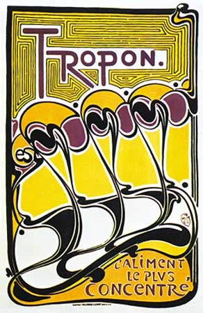 Art Nouveau rejected historicism and emphasized formal invention, and so it became a transitional movement from Victorian design to the modern art movements of the early 20th century. This sense of transition is quite evident in the work of the Belgian artist and designer Henry van de Velde (Velde, Henry van de). After turning from Post-Impressionist painting to furniture and graphic design in the 1890s, he used lines and shapes inspired by the natural world and abstracted them to the point that they appeared as “pure form”; that is, they appeared as abstract forms invented by the designer rather than as forms from nature. In works such as his poster for Tropon food concentrate (1899), undulating linear movements, organic shapes, and warm-hued colours combine into a nonobjective graphic expression. Although this poster has been interpreted as signifying the process of separating egg yolks and whites, the typical viewer perceives it as pure form.
 Similarly exploring issues of form, and inspired in part by the theories and work of the American architect Frank Lloyd Wright (Wright, Frank Lloyd), architects Charles Rennie Mackintosh (Mackintosh, Charles Rennie) and J. Herbert McNair joined artists (and sisters) Margaret and Frances Macdonald in a revolutionary period of creativity beginning in the 1890s. This group in Glasgow, Scotland, combined rectangular structure with romantic and religious imagery in their unorthodox furniture, crafts, and graphic designs. In a poster it made for the Glasgow Institute of Fine Arts (1895), for example, the group's emphasis upon rising vertical composition is evident.
Graphic design in the 20th century
Early developments
 In the first decade of the 20th century, the experiments with pure form begun in the 1890s continued and evolved. Although the Glasgow group received a cool reception in the British Isles, designers in Austria and Germany were inspired by their move toward geometric structure and simplicity of form. In Austria, a group of young artists led by Gustav Klimt (Klimt, Gustav) broke with the Künstlerhaus in 1897 and formed the Vienna Secession. These artists and architects rejected academic traditions and sought new modes of expression. In their exhibition posters and layouts and illustrations for the Secession magazine, Ver Sacrum, members pushed graphic design in uncharted aesthetic directions. Koloman Moser's poster for the 13th Secession exhibition (1902) blends three figures, lettering, and geometric ornament into a modular whole. The work is composed of horizontal, vertical, and circular lines that define flat shapes of red, blue, and white. Moser and architect Josef Hoffmann (Hoffmann, Josef) were instrumental in establishing the Wiener Werkstätte (“Vienna Workshops”), which produced furniture and design objects.
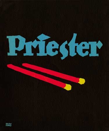 The German school of poster design called Plakatstil (“Poster Style”) similarly continued the exploration of pure form. Initiated by Lucian Bernhard with his first poster in 1905, Plakatstil was characterized by a simple visual language of sign and shape. Designers reduced images of products to elemental, symbolic shapes that were placed over a flat background colour, and they lettered the product name in bold shapes. Plakatstil gained numerous adherents, including Hans Rudi Erdt, Julius Gipkens, and Julius Klinger.
 Concurrent with these developments, in Germany Peter Behrens (Behrens, Peter) played an important role in graphic design. Behrens helped to develop a philosophy of Neue Sachlichkeit (“New Objectivity”) in design, which emphasized technology, manufacturing processes, and function, with style subordinated to purpose. In 1907 Emil Rathenau (Rathenau, Emil), head of the AEG (AEG AG) (Allgemeine Elektricitäts-Gesellschaft, a vast electrical manufacturing firm), appointed Behrens as artistic adviser for all of AEG's activities. Rathenau, a farsighted industrialist, believed industry needed the visual order and consistency that could only be provided by design. For AEG, Behrens developed what may be considered the first cohesive “visual identity system”; he consistently used the same logo (trademark), roman typeface styles, and geometric grids to create product catalogs, magazines, posters, other printed matter, and architectural graphics. Behrens's work for AEG was a harbinger of a major area of graphic design in the second half of the 20th century: the creation of a corporate identity through a program using trademarks, typefaces, formats, and colour in a consistent, controlled manner.
 In addition to such aesthetic, commercial, and corporate purposes, graphic design also played an important political role in the early 20th century, as seen in posters and other graphic propaganda produced during World War I. Colour printing had advanced to a high level, and governments used poster designs to raise funds for the war effort, encourage productivity at home, present negative images of the enemy, encourage enlistment in the armed forces, and shore up citizens' morale. Plakatstil was used for many Axis posters, while the Allies primarily used magazine illustrators versed in realistic narrative images for their own propaganda posters. The contrast between these two approaches can be seen in a comparison of German designer Gipkens's poster for an exhibition of captured Allied aircraft with American illustrator James Montgomery Flagg (Flagg, James Montgomery)'s army recruiting poster (both 1917). Gipkens expressed his subject through signs and symbols reduced to flat colour planes within a unified visual composition. In contrast, Flagg used bold lettering and naturalistic portraiture of an allegorical person appealing directly to the potential recruit. The difference between these two posters signifies the larger contrast between graphic design on the two continents at the time.
Modernist experiments between the world wars
Building upon the formal design experiments from the beginning of the century, between the world wars, European graphic designers utilized the new forms, organization of visual space, and expressive approaches to colour of such avant-garde movements as Cubism, Constructivism, De Stijl (Stijl, De), Futurism, Suprematism, and Surrealism. Inspired by these movements, graphic designers increasingly pursued the most elemental forms of design. Such a concern with the essential formal elements of a medium characterizes the Modernist experiments prevalent in all the arts of the period.
One pioneer of this approach was an American working in England, E. McKnight Kauffer, who was one of the first designers to understand how the elemental symbolic forms of Cubist and Futurist painting could be applied to the communicative medium of graphic design. Throughout the first half of the 20th century, his posters, book jackets, and other graphics achieved an immediacy and vitality well-suited to the fast-paced urban environment in which his visual communications were experienced.
Cassandre (the pseudonym of Adolphe-Jean-Marie Mouron) used figurative geometry and modulated planes of colour, derived from Cubism, to revitalize postwar French poster design. From 1923 until 1936, Cassandre designed posters in which he reduced his subject matter to bold shapes and flat, modulated icons. He emphasized two-dimensional pattern, and he integrated lettering with his imagery to make a unified overall composition. Cassandre also utilized airbrushed blends and grading to soften rigid geometry. His clients included steamship lines, railways, and clothing, food, and beverage companies.
The austere visual language developed by artistic movements such as De Stijl in The Netherlands and by Suprematism and Constructivism in Russia influenced a Modernist approach to page layout. Suprematism, founded by Kazimir Malevich (Malevich, Kazimir), inspired a young generation of designers to move toward a design based on the construction of simple geometric forms and elemental colour. Attributes of this approach in design included an underlying structure of geometric alignments, asymmetrical composition, elemental sans-serif typefaces, and simple geometric elements. Ornament was rejected, and open areas of white space were used as compositional elements. Works by the Russian Constructivist El Lissitzky (Lissitzky, El) exemplify this design approach. He developed design programs that utilized consistent type elements and placements. For example, his 1923 book design for Vladimir Mayakovsky's (Mayakovsky, Vladimir Vladimirovich) Dlya golosa (For the Voice) is a seminal work of graphic design. The title spread for each poem is constructed into a dynamic visual composition, with geometric elements having symbolic meaning. In the title page to one poem, Lissitzky used a large red circle to signify the sun, the subject of the poem.
The Bauhaus, a German design school founded in 1919 with architect Walter Gropius (Gropius, Walter) as its director, became a crucible where the myriad ideas of modern art movements were examined and synthesized into a cohesive design movement. In its initial years, the Bauhaus held an Expressionist and utopian view of design, but it later moved toward a functionalist approach. Bauhaus artists and designers sought to achieve a new unity between art and technology and to create functional designs—often utilizing the pure forms of Modernism—that expressed the mechanization of the machine age. In 1923 the Hungarian Constructivist László Moholy-Nagy (Moholy-Nagy, László) joined the faculty. Among his numerous contributions, Moholy-Nagy introduced a theoretical approach to visual communications. Important in his theory was the use of photomontage (a composite photographic image made by pasting or superimposing together different elements) as an illustrative medium. He also promoted the integration of words and images into one unified composition and the use of functional typography.
Herbert Bayer (Bayer, Herbert) was appointed first master of the newly founded Druck und Reklame (“Printing and Advertising”) workshop at the Bauhaus in 1925. Bayer's poster for Wassily Kandinsky's 60th-birthday exhibition (1926) incorporates Constructivist and De Stijl influences. It clearly embodies the Bauhaus design philosophy: elemental forms are shorn of ornament, and forms are selected and arranged in order to serve a functional purpose (“clarity of information”), with a visual hierarchy of size and placement in descending prominence from the most important to secondary facts. The elements are masterfully balanced and aligned to create a cohesive composition, and the tilting at a diagonal angle energizes the space.
 The unprecedented graphic designs produced during this period were explained and demonstrated to printers and designers through writings and designs by Jan Tschichold (Tschichold, Jan), a young German designer. As a result, many designers in Europe and throughout the world embraced this new approach to graphic design. An announcement for Tschichold's book Die neue Typographie (1928; “The New Typography”) typifies his own philosophy. Tschichold advocated functional design that uses the most direct means possible. His systematic methodology emphasized contrast of type sizes, widths, and weights, and he used white space and spatial intervals as design elements to separate and organize material. He included only elements that were essential to the content and page structure.
Many designers sought other ways to use geometry to evoke a modern spirit for the machine age. Art Deco, streamline, and moderne are terms used to denote the loosely defined trend in art, architecture, and design from the 1920s to the 1940s that utilized decorative, geometric designs. Everything from skyscrapers to furniture to—in the case of graphic design—cosmetics packaging, posters, and typefaces used zigzag forms, sunbursts, and sleek geometric lines to project a feeling of a new technological era.
At the same time, a number of Dutch designers, including Piet Zwart, drew upon the Modernist vocabulary of form and colour to develop unique personal approaches to graphic design, applying their vision to the needs of clients. While working at an architectural firm in the early 1920s, Zwart received commissions for graphic-design projects by happenstance. In his work from the 1920s and '30s, he rejected the conventional norms of typography and instead approached the layout of an ad or brochure as a spatial field upon which he created dynamic movements and arresting forms. An example of this can be seen in his dynamic advertisement for NKF cable factory (1924), which proclaims, “Normaal cable is the best cable for the price.” Zwart believed the fast pace of 20th-century life meant viewers had little time for lengthy advertising copy. He used brief telegraphic text, bold typefaces placed at an angle, and bright colours to attract attention and to convey his client's message quickly and effectively.
Swiss designers also brought tremendous vitality to graphic design during this period. After studying in Paris with Fernand Léger (Léger, Fernand) and assisting Cassandre on poster projects, Herbert Matter (Matter, Herbert) returned to his native Switzerland, where from 1932 to 1936 he designed posters for the Swiss Tourist Board, using his own photographs as source material. He employed the techniques of photomontage and collage in his posters, as well as dynamic scale changes, large close-up images, extreme high and low viewpoints, and very tight cropping of images. Matter carefully integrated type and photographs into a total design.
When the Nazis rose to power in Europe during the 1930s, Modernist experiments were denounced, and many artists, architects, and designers immigrated to the United States. This migration, along with their professional and teaching activities, would play a major role in shaping postwar American art and design. During World War II, posters were used once again as a major form of political propaganda, although they then functioned alongside radio broadcasts and propaganda films in governmental war efforts.
Graphic design, 1945–75
The International Typographic Style
After World War II, designers in Switzerland and Germany codified Modernist graphic design into a cohesive movement called Swiss Design, or the International Typographic Style. These designers sought a neutral and objective approach that emphasized rational planning and de-emphasized the subjective, or individual, expression. They constructed modular grids of horizontal and vertical lines and used them as a structure to regularize and align the elements in their designs. These designers preferred photography (another technical advance that drove the development of graphic design) as a source for imagery because of its machine-made precision and its ability to make an unbiased record of the subject. They created asymmetrical layouts, and they embraced the prewar designers' preference for sans-serif typefaces. The elemental forms of the style possessed harmony and clarity, and adherents considered these forms to be an appropriate expression of the postwar scientific and technological age.
Josef Müller-Brockmann was a leading designer, educator, and writer who helped define this style. His poster, publication, and advertising designs are paradigms of the movement. In a long series of Zürich concert posters, Müller-Brockmann used colour, an arrangement of elemental geometric forms, and type to express the structural and rhythmic qualities of music. A 1955 poster for a concert featuring music by Igor Stravinsky, Wolfgang Fortner, and Alban Berg demonstrates these properties, along with Müller-Brockmann's belief that using one typeface in two sizes (display and text) makes the message clear and accessible to the audience.
The programmatic uniformity of this movement would be widely adopted by designers working in the area of visual identity systems during the second half of the 20th century. Multinational corporations soon adopted the tenets of the International Typographic Style: namely, the standardized use of trademarks (trademark), colours, and typefaces; the use of consistent grid formats for signs and publications; the preference for the contemporary ambience of sans-serif types; and the banishment of ornament.
Postwar graphic design in the United States
While designers in Europe were forging the International Typographic Style into a cohesive movement, American designers were synthesizing concepts from modern art into highly individualistic and expressive visual statements. From the 1940s through the 1960s, New York City was a major centre for innovation in design as well as the fine arts.
During the 1940s, Paul Rand (Rand, Paul) emerged as an American designer with a personal and innovative approach to modern design. Rand understood the vitality and symbolic power of colour and shape in the work of artists such as Paul Klee (Klee, Paul), Wassily Kandinsky (Kandinsky, Wassily), and Pablo Picasso. In a 1947 poster promoting New York subway advertising, for example, Rand created a design from elemental geometric forms and colours that can be read as both an abstracted figure as well as a target, conveying the concept that one can “hit the bull's-eye,” or reach potential audiences for plays, stores, and other goods and services by advertising in the subway. An ordinary message is rendered extraordinary through the power of visual forms and symbols. Rand's work spanned a range of graphic media including advertising, book jackets, children's books, corporate literature (such as annual reports), packaging, posters, trademarks, and typefaces.
In the 1950s Rand began to spend more of his time on corporate image projects, and he designed what would become ubiquitous trademarks and visual identities for major corporations including IBM, Westinghouse, the ABC television network, and UPS. Many other prominent designers—including Saul Bass (Bass, Saul) (whose many visual identity programs included logos for AT&T), Lester Beall, and the partnership of Tom Geismar and Ivan Chermayeff—focused their practices upon corporate design, as multinational corporations understood the need for consistent graphic standards in their facilities and communications throughout the world.
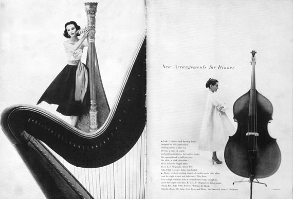
Bradbury Thompson, a prominent magazine art director, designed a publication called Westvaco Inspirations for a major paper manufacturer from 1938 until the early 1960s. His playful and innovative approach to type and imagery is shown in the design of a spread from Westvaco Inspirations 210 (1958). Here, Thompson responded to the geometric forms of African masks in the Ben Somoroff photograph in the spread by “drawing” a masklike face out of letters spelling “Westvaco.” Thompson's complex layouts combined art with coloured shapes and unusual typographic arrangements. He explored printing techniques by separating the four plates used to print full-colour images—cyan (a warm blue), magenta, yellow, and black—and having them printed in different positions on the page. He also had engravings from old books enlarged and overprinted in unexpected colours. These experiments were very influential, as they showed a generation of designers new possibilities.
 Magazines (magazine) placed more emphasis upon graphic design during the postwar period. Alexey Brodovitch (Brodovitch, Alexey), the art director of Harper's Bazaar from 1934 until 1958, pioneered a new approach to magazine design. He created a flowing perceptual experience for the reader who paged through his magazines by varying sizes of type and imagery, alternating complex pages with simple layouts containing large areas of white space, and creating an overall sense of rhythmic movement. The beauty of Brodovitch's designs was enhanced by the impressive team of collaborators at Bazaar, which included photographer Richard Avedon (Avedon, Richard).
The postwar period has been called a “golden age” of magazine design, when art directors including Henry Wolf (at Esquire and Harper's Bazaar) and Otto Storch (at McCall's) extended Brodovitch's imaginative approach to page layout in large-format magazines. Storch believed concept, text, type, and image should be inseparable in editorial design, and he applied this belief to the editorial pages of McCall's.
 The emergence of television began to alter the roles of print media and graphic design, while also creating new opportunities for designers to work on television commercials and on-air graphics. “Motion graphics” are kinetic graphic designs for film titles and television that occur in the fourth dimension—time. A variety of animated film techniques were applied to motion-picture titling in the 1950s by Saul Bass (Bass, Saul) and, in Canada, by Norman McLaren of the Canadian National Film Board. For example, Bass's titles for Otto Preminger's 1959 film Anatomy of a Murder reduce a prone figure to disjointed parts, which move onto the screen in carefully orchestrated sequences that conclude with their positioning to form the figure; the lettering of the film's title appears as part of the sequence.
Vernacular imagery and popular culture inspired a generation of American designer/illustrators who began their careers after World War II, including the 1954 founders of the Push Pin Studio in New York. Their work combined a fascination with the graphic simplicity and directness of comic books with a sophisticated understanding of modern art, especially of Surrealism and Cubism. The Push Pin artists' unabashedly eclectic interest in art and design history led them to incorporate influences ranging from Persian rugs to children's art and decorative Victorian typefaces. In their work, a graphic vibrancy supported a strong conceptual approach to the visual message.
Several major directions emerged in American graphic design in the 1960s. Political and social upheavals of the decade were accompanied by a resurgence of poster art addressing the civil rights movement, the women's movement, environmentalism, and the Vietnam War. Placing ads on radio and television was beyond the economic means of most private citizens, independent art groups, and social-activist organizations; however, they could afford to print and distribute flyers and posters, and they could even sell their posters to public sympathizers to raise money for their causes.
 As popular music became increasingly culturally significant, graphics for the recording industry emerged as a locus of design creativity. One Push Pin Studio founder, Milton Glaser (Glaser, Milton), captured the imagination of a generation with his stylized curvilinear drawing, bold flat colour, and original concepts. Glaser's poster (1967) for folk-rock musician Bob Dylan (Dylan, Bob) is one of many music graphics from the 1960s that achieved an iconic presence not unlike that of Flagg's I Want You poster from World War I. Over the course of the second half of the century, Glaser steadily expanded his interests to include magazine design, restaurant and retail store interiors, and visual identity systems.
The 1960s also saw the rapid decline of hand- and machine-set metal type as they were replaced by display-and-keyboard phototype (photocomposition) systems. Since it is very inexpensive to produce new typefaces for photographic typesetting, the widespread use of phototype systems set off a spate of new designs and reissues of long-unavailable typefaces, such as decorative Victorian wood types. American Herb Lubalin is notable among the designers who embraced the new flexibility phototype made possible for designers. Type could be set in any size, the spaces between letters and lines could be compressed, and letters could be expanded, condensed, touched, overlapped, or slanted. Lubalin's ability to make powerful visual communications solely with type is seen in a 1968 announcement for an antiwar poster contest sponsored by Avant Garde magazine. The magazine's logo, placed in the dot of the exclamation point, uses ligatures (two or more letters combined into one form) and alternate characters to form a tightly compressed image. This logo was developed into a typeface named Avant Garde, one of the most successful and widely used fonts of the phototype period.
A creative revolution in advertising writing and design also occurred during this period. Advertising agencies approached marketing objectives through the use of witty headlines, simple layouts, and clever visual images. Copywriters and art directors, working as collaborative creative teams, sought a synergy between word and image. The Doyle Dane Bernbach advertising agency played an influential role in the history of graphic design by creating advertisements that spoke intelligently to consumers and avoided the hyperbole of the typical “hard sell.”
 One of the many advertising designers who launched his career at Doyle Dane Bernbach was George Lois, whose works were engagingly simple and direct. Lois went on to design over 90 covers for Esquire magazine in the 1960s. He used powerful photographs and photomontages, usually by Carl Fischer, to make succinct editorial statements about the United States. These designs acted as independent visual/verbal statements about such topics as assassinations and civil rights.
Postwar graphic design in Japan (arts, East Asian)
During the 1960s and '70s, American graphics from the New York area, as well as European graphics from the International Typographic Style, influenced designers around the world.
In postwar Japan, for example, when the country emerged as a major industrial power, graphic design evolved into a major profession serving the needs of industry and cultural institutions. European Constructivism and Western design exerted an important influence on Japanese design, but these lessons were assimilated with traditional Japanese art theory. For example, the Japanese tradition of family crests inspired many Japanese designers' approach to trademark design. Similarly, symmetrical composition, central placement of iconic forms, harmonious colour palettes, and meticulous craftsmanship—all characteristics of much of Japanese art—were often elements of Japanese graphics.
The first generation of graphic designers to emerge after the war was led by Kamekura Yusaku, whose importance to the emerging graphic-design community led to the affectionate nickname “Boss.” Kamekura's poster proposal (1967) for the Japanese World Expo '70 in Ōsaka, for example, displays his ability to combine 20th-century Modernist formal experiments with a traditional Japanese sense of harmony.
In counterpoint to the formalist tendencies found in much Japanese graphic design, some Japanese designers drew upon other sources of inspiration to arrive at individual approaches to visual-communications problems. Iconography from diverse mass media—including comic books (manga), popular science-fiction movies, and newspaper photographs—provided a rich vocabulary for Yokoo Tadanori, whose work beginning in the 1960s inspired a new generation of Japanese designers. In his early posters and magazine covers he utilized a variety of contemporary techniques; for example, he used crisp line drawings to contain photomechanical screens of colour. He worked in a Pop-art (Pop art) idiom, but he used revered Japanese imagery as source material, rather than the contemporary imagery usually found in Pop art. In his poster publicizing four Noh theatre productions (1969), for example, he placed iconic images on a luminous gold-and-blue field, combining traditional imagery with a contemporary sense of whimsy. Over time, montage effects became increasingly important to Yokoo as he built his designs from photographic and graphic elements filled with dramatic luminosity.
A very different vision emerged in the work of Satō Kōichi, who from the 1970s created an otherworldly, metaphysical design statement. He used softly glowing blends of colour, richly coloured and modulated calligraphy, and stylized illustrations to create poetic visual statements that ranged from contemplative quietude to celebratory exuberance. For example, in his poster (1988) for a musical play—which was itself adapted from a nursery rhyme about soap bubbles—Satō combined an astronomical sky chart and a handprint glowing with a lavender-and-blue aura to evoke a feeling of ephemeral atmospheric space. Such designs achieve a rare level of visual poetry.
Graphic design, 1975–2000
Postmodern graphic design
By the late 1970s, many international architectural, product, and graphic designers working in the Modernist tradition thought that the movement had become academic and lost its capacity for innovation. Younger designers challenged and rejected the tenets of Modernism and questioned the “form-follows-function” philosophy that came to be associated with the diluted, corporate version of Modernism that derived from the International Typographic Style. Designers began to establish and then violate grid patterns; to invert expected forms; to explore historical and decorative elements; and to inject subjective—even eccentric—concepts into design. This reaction to Modernist developments is called postmodernism, and it took design in many new directions.
During the late 1970s, April Greiman was acclaimed for her postmodernist experimentation. (In the 1970s and '80s, increasing numbers of women entered the graphic-design field and achieved prominence.) Her dynamic typographic innovations and colourful montages were often made in collaboration with photographer Jayme Odgers. A cover for WET magazine, for example, evokes the vibrant cultural scene in southern California. In this work from 1979, a colour photocopy of singer Rick Nelson (Nelson, Rick), collaged images from magazines, Japanese papers, and airbrushed blends of colour are combined into a cohesive design. Greiman also explored the application of video imagery to print graphics.
The dynamic spatial arrangement and decorative geometric patterns that enliven many postmodern designs are seen in a 1983 poster designed by William Longhauser. The letters forming the last name of postmodern architect Michael Graves (Graves, Michael) become fanciful edifices, which echo the patterns and textures found in Graves's buildings. As with much postmodern design, the result is strikingly original.
Such a disruption of expected forms and grids was also apparent in the work of Japanese designer Igarashi Takenobu. After studying design fundamentals in Los Angeles, Igarashi began his independent design practice in Tokyo and used basic design elements—point, line, plane, grids, and isometric perspectives—as the building blocks of his work. This design vocabulary enabled him to invent imaginative solutions. His poster proposal (1982) for Expo '85, an international exposition of the dwelling and construction industry, turns the letters into structural forms pulled apart to reveal their inner structures. In this way, his experimentation with form fulfilled both an aesthetic and a commercial purpose: the deconstructed forms clearly make reference to his client, the construction industry.
Graphic design in developing nations
Late in the 20th century, increasingly accomplished graphic-design activity began to appear in developing nations. These advancements occurred because of a number of factors, including expanded access to professional education at local schools and abroad, the increased availability of computer and printing technology, and a growing base of industrial, cultural, and communications-industry clients. Designers from these nations often drew upon established design approaches from industrialized nations, but they commingled these lessons with local and national traditions in their quest for effective visual communications.
 In the Middle East, graphic designers often applied new technology to depictions of traditional subject matter and iconography. Throughout the late 20th century, Iranian graphic designer Ghobad Shiva evoked the colour palette, traditional Arabic calligraphy, and page layouts of ancient Persian manuscripts in his graphic work, which ranged from packaging to advertising and editorial design to stage sets. His poster (1984) celebrating the 800th anniversary of the birth of the renowned Iranian poet Saadi, for example, displays his exquisite control of colour and his ability to create a vibrant image. These stylized illustrations continued the traditions of ancient Persian manuscript books, but within the context of a contemporary design idiom.
Graphic design developed slowly in Africa after World War II, but by the end of the 20th century, a number of designers there received international acclaim for their individual creations. In Zimbabwe, filmmaker and designer Chaz Maviyane-Davies created films and graphic designs in the late 1980s and the 1990s. His posters, advertising designs, and magazine covers captured the spirit and life of his nation and often promoted social change. At the turn of the 21st century, Maviyane-Davies was living in the United States. His interest in photographic symbolism, prop building, and computer manipulation were seen in a powerful poster series that included The Last Portal of Truth 42, produced just before the 2002 Zimbabwean elections.
In Latin America (Latin America, history of), professional graphic design similarly developed slowly after World War II. Eventually, in Argentina and then in other nations, a graphic-design profession began to evolve. Latin American designers often built upon European and North American influences to develop distinctive communication designs. For example, a film festival poster (1992) by Venezuelan designer Santiago Pol utilizes clear symbolic forms within a highly sophisticated spatial configuration, both elements of Modernist graphic design. In this work, dynamic shapes signify three peppers, symbols that are redolent with regional symbolism; the central pepper is formed by the white, or negative, space between the red and green ones. These peppers are punctuated by film sprocket holes, which connect the image to the poster's theme of film. In this way, Pol's creative combination of symbols provides a distinct regional image for the film festival.
The digital (digital computer) revolution
Until the late 20th century, the graphic-design discipline had been based on handicraft processes: layouts were drawn by hand in order to visualize a design; type was specified and ordered from a typesetter; and type proofs and photostats of images were assembled in position on heavy paper or board for photographic reproduction and platemaking. Over the course of the 1980s and early '90s, however, rapid advances in digital computer hardware and software radically altered graphic design.
 Software for Apple (Apple Inc.)'s 1984 Macintosh computer, such as the MacPaint™ program by computer programmer Bill Atkinson and graphic designer Susan Kare, had a revolutionary human interface. Tool icons controlled by a mouse or graphics tablet enabled designers and artists to use computer graphics in an intuitive manner. The Postscript™ page-description language from Adobe Systems, Inc., enabled pages of type and images to be assembled into graphic designs on screen. By the mid-1990s, the transition of graphic design from a drafting-table activity to an onscreen computer activity was virtually complete.
Digital computers placed typesetting tools into the hands of individual designers, and so a period of experimentation occurred in the design of new and unusual typefaces and page layouts. Type and images were layered, fragmented, and dismembered; type columns were overlapped and run at very long or short line lengths; and the sizes, weights, and typefaces were often changed within single headlines, columns, and words. Much of this research took place in design education at art schools and universities. American designer David Carson—art director of Beach Culture magazine in 1989–91, Surfer in 1991–92, and Ray Gun magazine in 1992–96—captured the imagination of a youthful audience by taking such an experimental approach into publication design.
 Rapid advances in onscreen software also enabled designers to make elements transparent; to stretch, scale, and bend elements; to layer type and images in space; and to combine imagery into complex montages. For example, in a United States postage stamp from 1998, designers Ethel Kessler and Greg Berger digitally montaged John Singer Sargent (Sargent, John Singer)'s portrait of Frederick Law Olmsted (Olmsted, Frederick Law) with a photograph of New York's Central Park, a site plan, and botanical art to commemorate the landscape architect. Together these images evoke a rich expression of Olmsted's life and work.
The digital revolution in graphic design was followed quickly by public access to the Internet. A whole new area of graphic-design activity mushroomed in the mid-1990s when Internet commerce became a growing sector of the global economy, causing organizations and businesses to scramble to establish Web sites. Designing a Web site involves the layout of screens of information rather than of pages, but approaches to the use of type, images, and colour are similar to those used for print. Web design, however, requires a host of new considerations, including designing for navigation through the site and for using hypertext links to jump to additional information. An example of strong Web design is the Herman Miller (Herman Miller, Inc.) for the Home Web site, designed by BBK Studio in 1998. These designers created a strong visual identity, effective navigation, and informational clarity. Attributes that added to the effectiveness of this Web site included a consistent colour palette, an informative use of pictures of products, and a scrolling montage of products.
Because of the international appeal and reach of the Internet, the graphic-design profession is becoming increasingly global in scope. Moreover, the integration of motion graphics, animation, video feeds, and music into Web-site design has brought about the merging of traditional print and broadcast media. As kinetic media expand from motion pictures and basic television to scores of cable-television channels, video games, and animated Web sites, motion graphics are becoming an increasingly important area of graphic design.
In the 21st century, graphic design is ubiquitous; it is a major component of our complex print and electronic information systems. It permeates contemporary society, delivering information, product identification, entertainment, and persuasive messages. The relentless advance of technology has changed dramatically the way graphic designs are created and distributed to a mass audience. However, the fundamental role of the graphic designer—giving expressive form and clarity of content to communicative messages—remains the same.
Additional Reading
Good general sources include Steven Heller and Seymour Chwast, Graphic Style from Victorian to Digital (2000), which classifies over 700 illustrations of graphic designs according to stylistic attributes, accompanied by brief texts; Alan Livingston and Isabella Livingston, The Thames and Hudson Encyclopaedia of Graphic Design and Designers (1992), which has over one thousand entries on designers, terms, and movements; and Philip B. Meggs, A History of Graphic Design, 3rd ed. (1998), which gives an overview of the evolution of graphic design from prehistoric pictographs to the digital revolution and is copiously illustrated.Studies on specific aspects of design include Norma Laearie, The Art & History of Books (1968, reissued 1995), a survey of the progression of book design and production from early manuscripts to 20th-century fine printing; and John Lewis, Anatomy of Printing: The Influences of Art and History on Its Design (1970).Studies of specific periods of design include Jonathan J.G. Alexander, Medieval Illuminators and Their Methods of Work (1992); Ellen Mazur Thomson, The Origins of Graphic Design in America, 1870–1920 (1997); and Laurel Harper, Radical Graphics/Graphic Radicals (1999), which displays works by designers who from 1985 to 1999 have broken with design traditions.Several important and lavishly illustrated periodicals cover contemporary graphic design and visual communications. Communication Arts (8/yr.), published by Coyne & Blanchard, showcases portfolios of contemporary visual communications; four special annual issues present competitions in illustration (July), photography (August), design (November), and advertising (December). The bimonthly Graphis, published by Graphis Inc., presents articles and works by contemporary visual communicators and covers outstanding practitioners from many countries. Print: America's Graphic Design Magazine, also bimonthly, published by RC Publications, deals with contemporary visual communications; three issues are devoted to annual competitions in European design (by country), interactive media design, and American graphic design (by region), respectively.
- Jock Sutherland
- Jodelle, Étienne
- Jodhpur
- Jodie Foster
- Jodl, Alfred
- Jodrell Bank Observatory
- Jody Williams
- Joe Adonis
- Joe Biden
- Joe Calzaghe
- Joe Clark
- Joe Davis
- Joe DiMaggio
- Joe Frazier
- Joe Gans
- Joe Hill
- Joe Lapchick
- Joel Barlow
- Joel, Billy
- Joel, Book of
- Joel Chandler Harris
- Joel H. Hildebrand
- Joel Lehtonen
- Joel McCrea
- Joe Louis